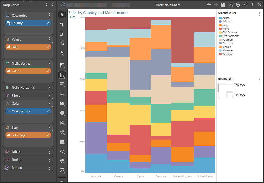
The Marimekko Chart is similar to a stacked 100 column chart, but the proportional value of each category is indicated not only by segment height, but also by column width. This is a good way to view charts containing multiple member hierarchies.
For example, in the chart below we see Sales across a number of countries and manufacturers.
Building a Marimekko Chart
To display your query in a Marimekko chart, you will:
- Add a measure to both the Values and Size drop zones. The measure in the Values zone drives the height of the column segments, while the measure in the Size drop zone drives the column width. The measure assigned to Size may or may not be the same measure added to Values.
- Add the member hierarchy that should be represented on the x-axis to the Categories drop zone.
- Add the hierarchy you want to segment your columns by to the Color drop zone. The elements in this hierarchy will drive the color of the column segments.
Before you begin
Create a new discovery from the User Hub, App Tabs, or on the right-click in the Content Explorer. As part of this process, you will need to open the appropriate Data Model for your analysis. For more information, see Access Discover Pro.
Step 1: Create the Basic Discovery
- Use one of the following methods to add the first hierarchy:
- If the discovery is empty, you can drag a chip from the Dimensions panel and drop it onto the desired visual type on the canvas.
- Alternatively, double-click the hierarchy in the Dimensions panel to add it to the default drop zone.
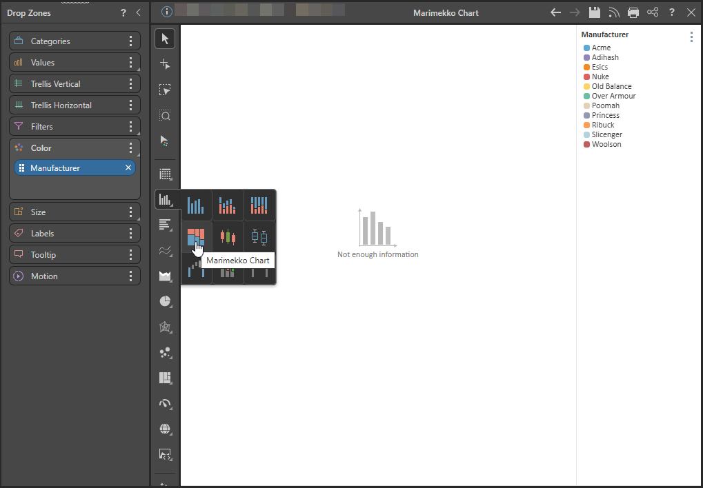
- Select Column Chart > Marimekko Chart from the toolbox.
Step 2: Add Hierarchies and Measures
Add the following to the drop zones:
- Categories: Add the member hierarchy that should be on the x-axis to the Categories drop zone.
- Color: Add the member hierarchy that should drive the color of the segments to the Color drop zone.
- Values: Add the value that should be on the y-axis to the Values drop zone.
- Size: Add the value that should drive the column width to the Size drop zone.
Important: The two measures may be the same if required.